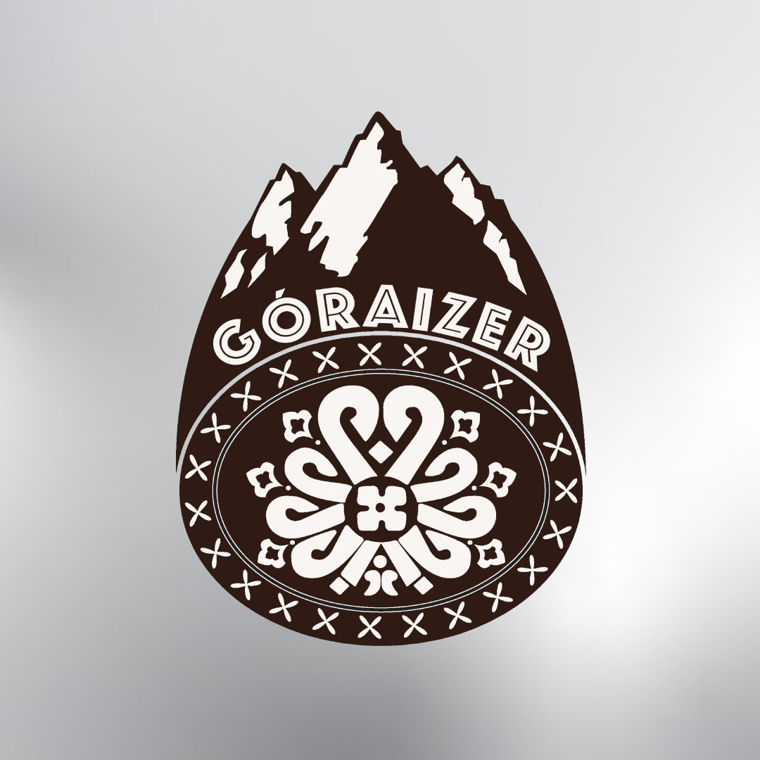
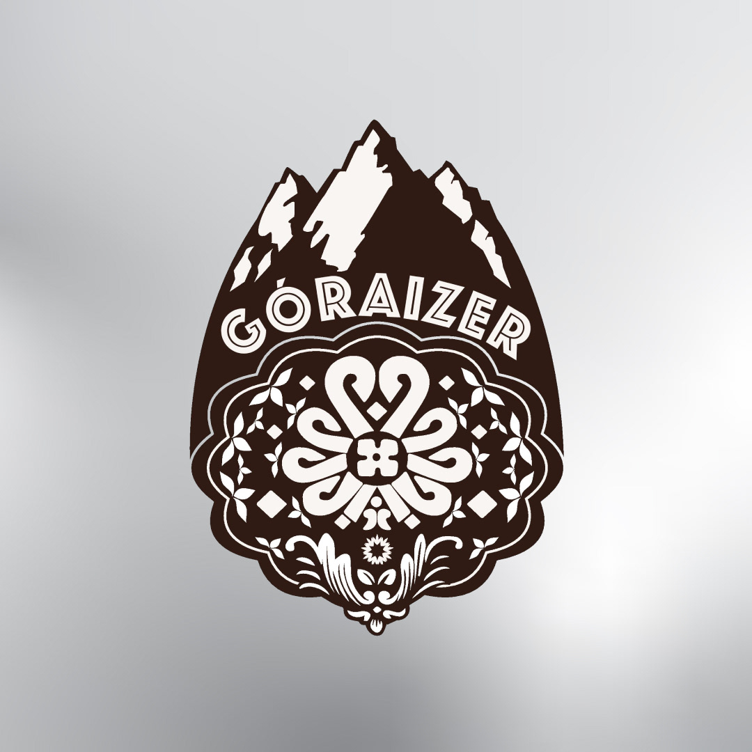
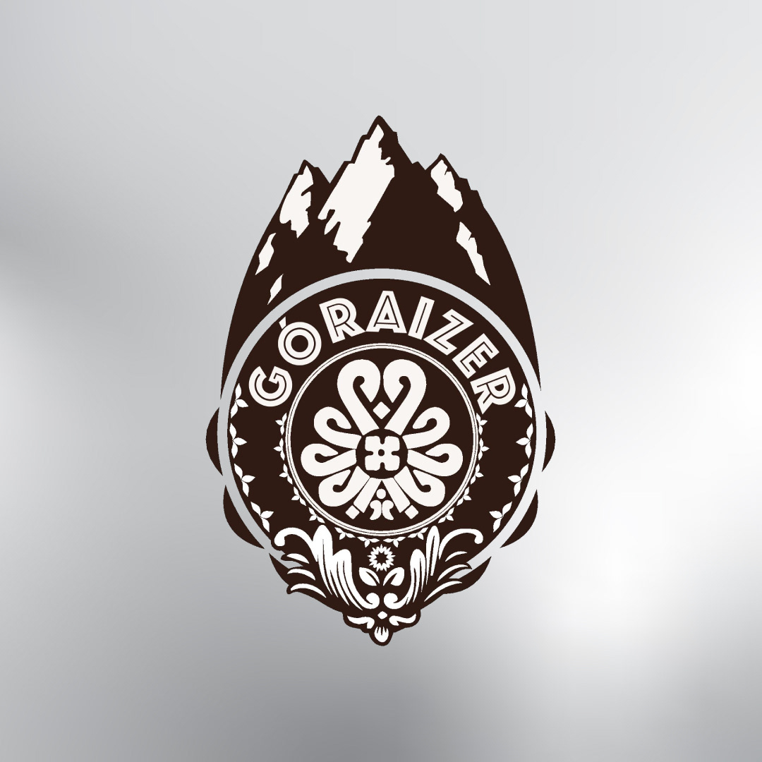
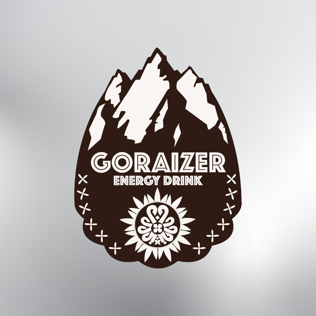
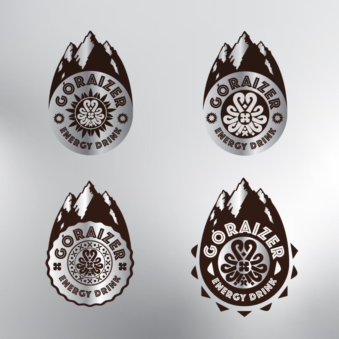
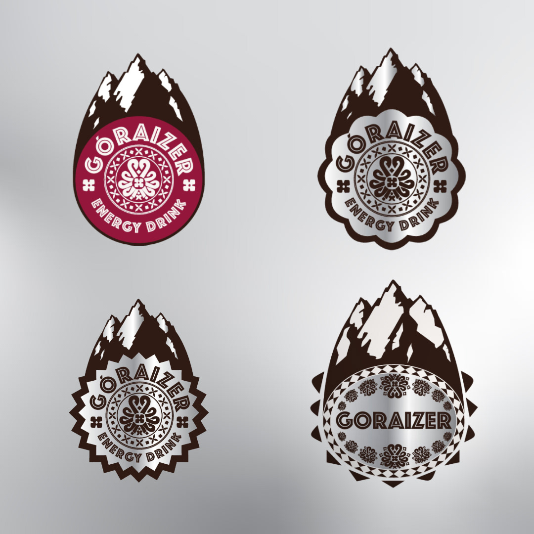
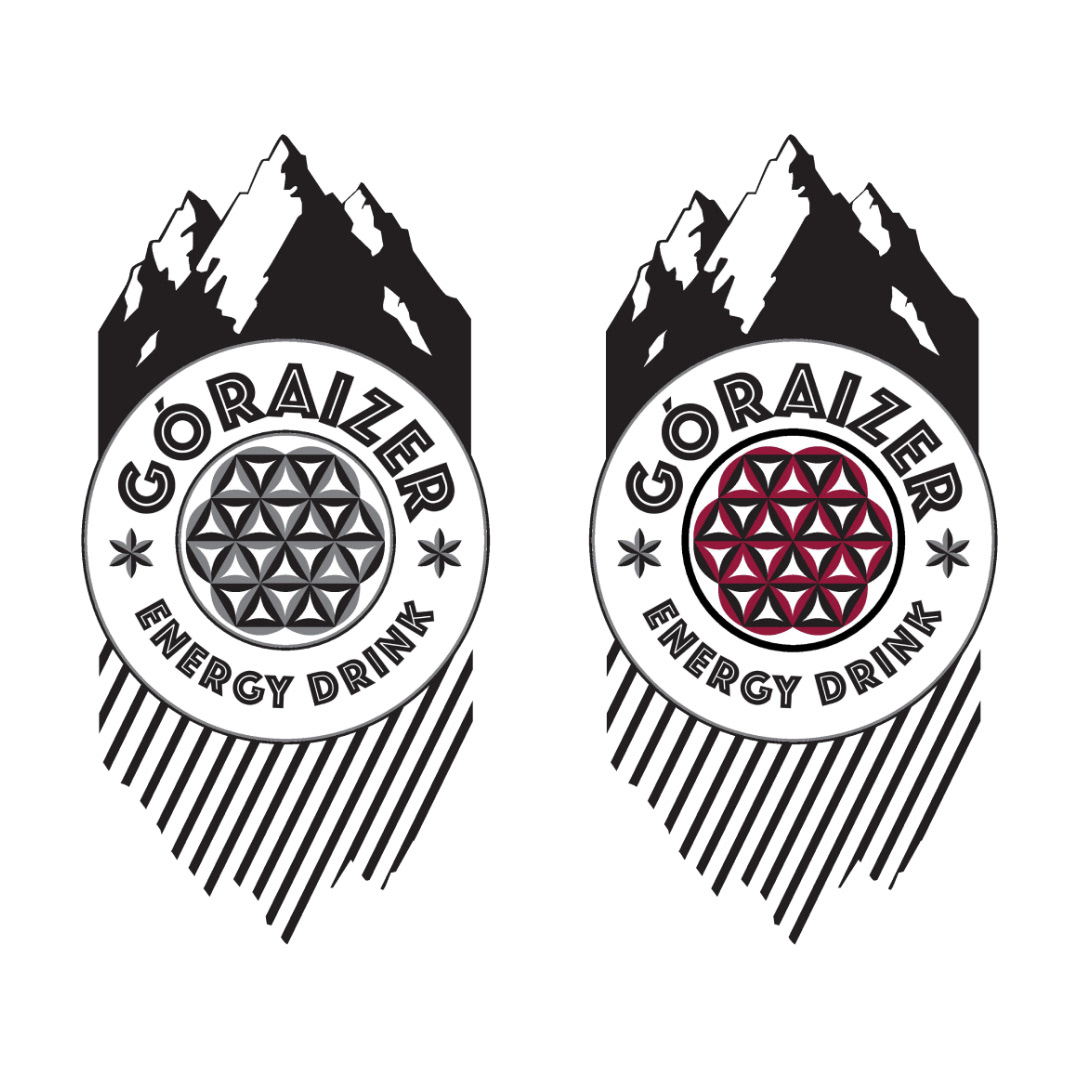
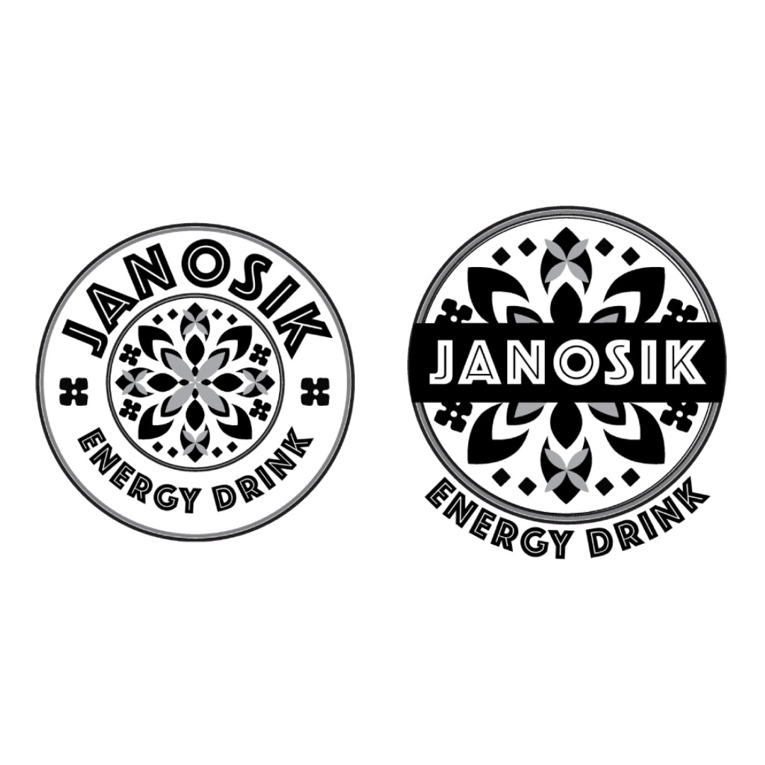
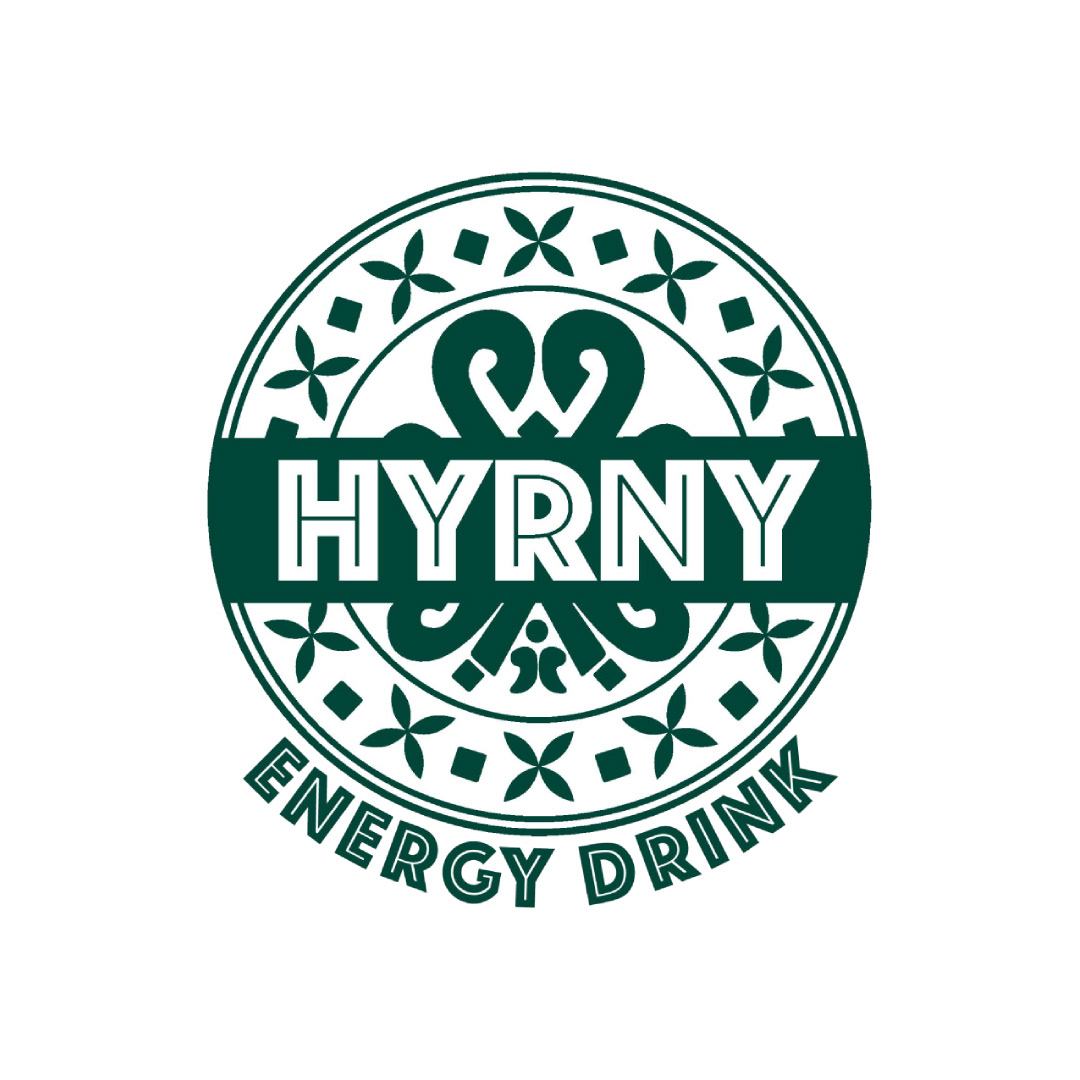
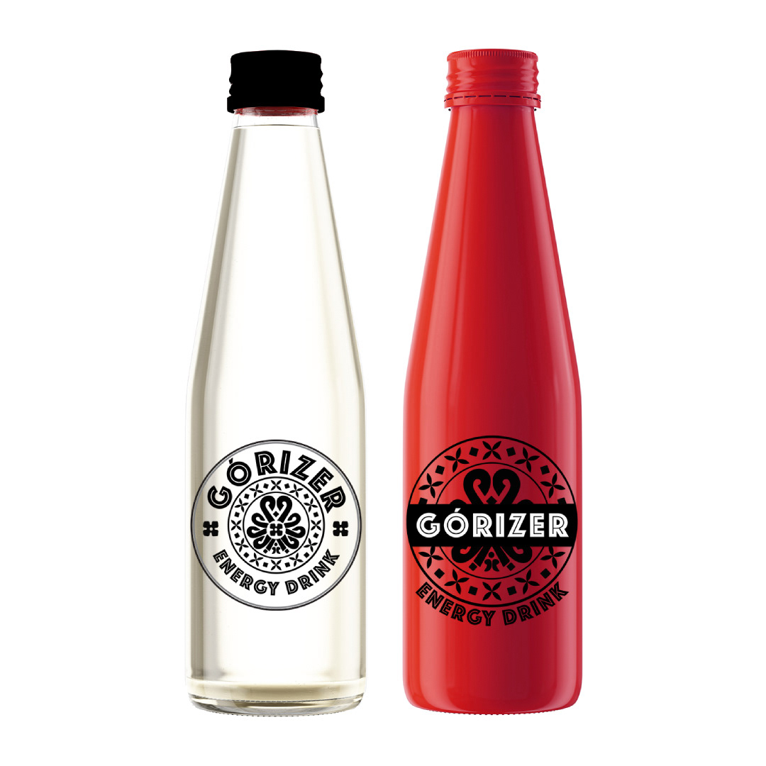
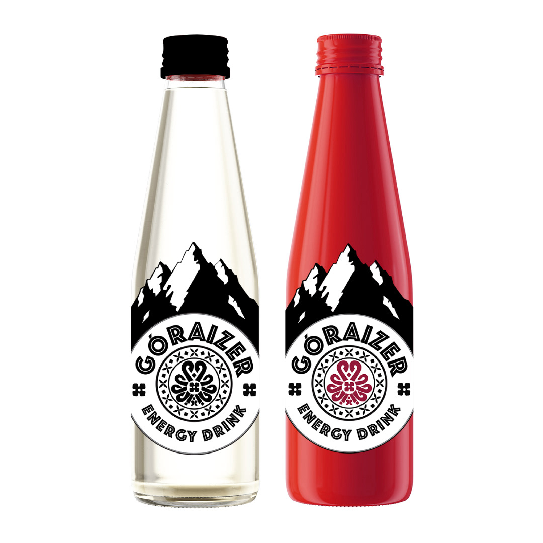
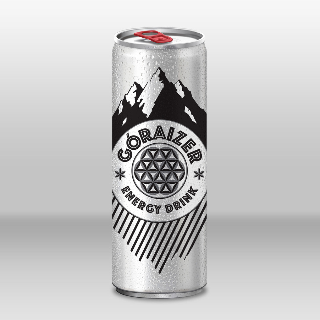
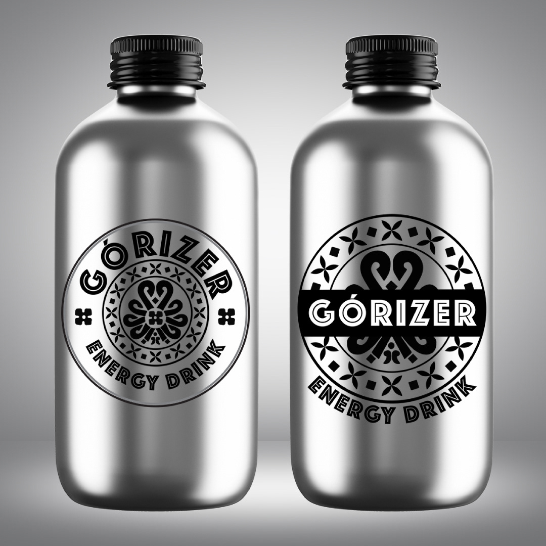
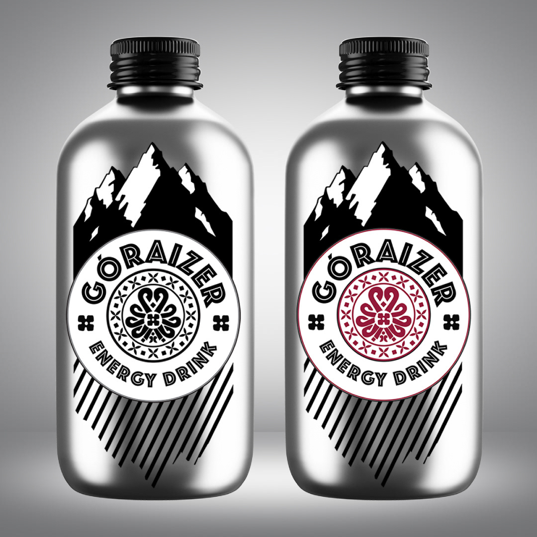
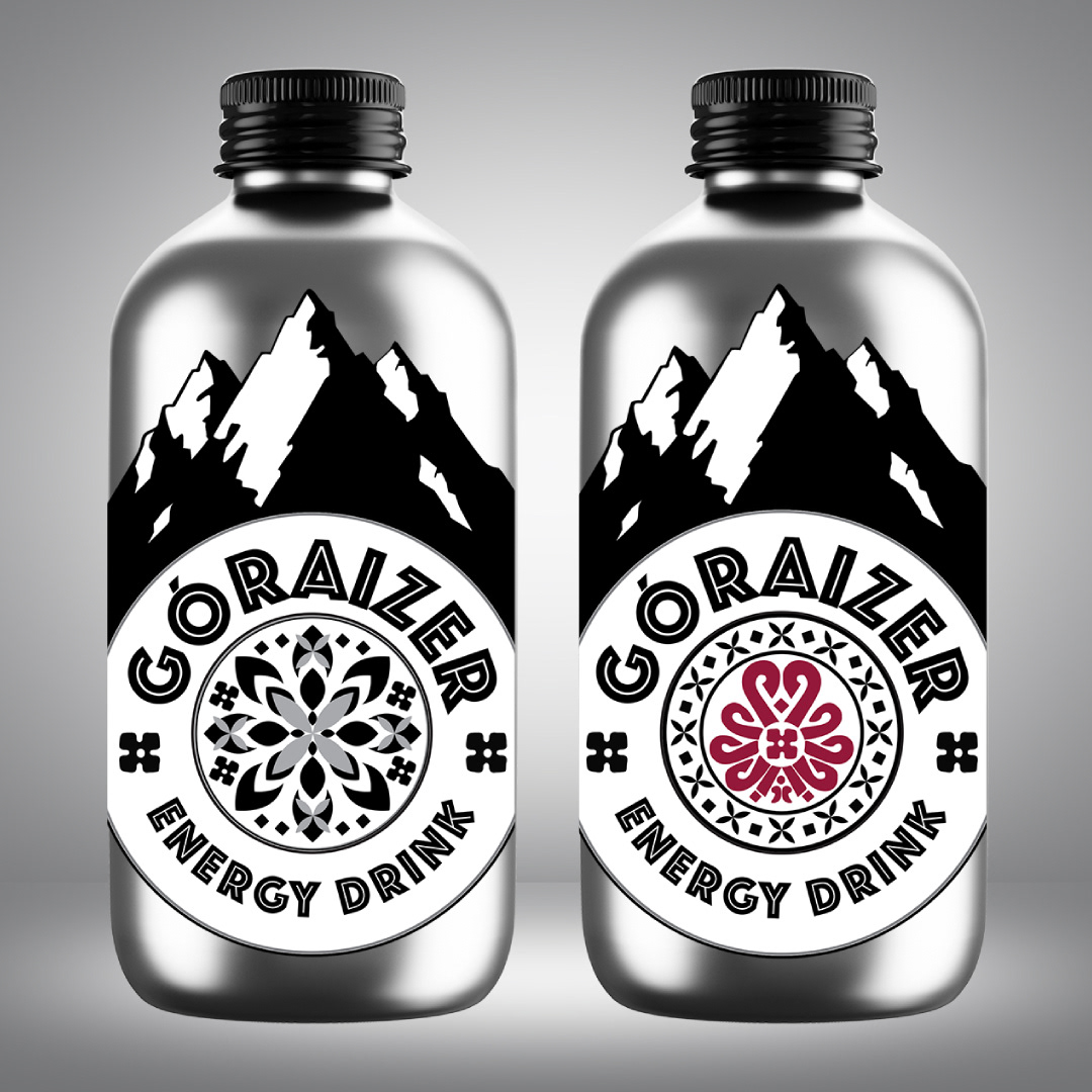
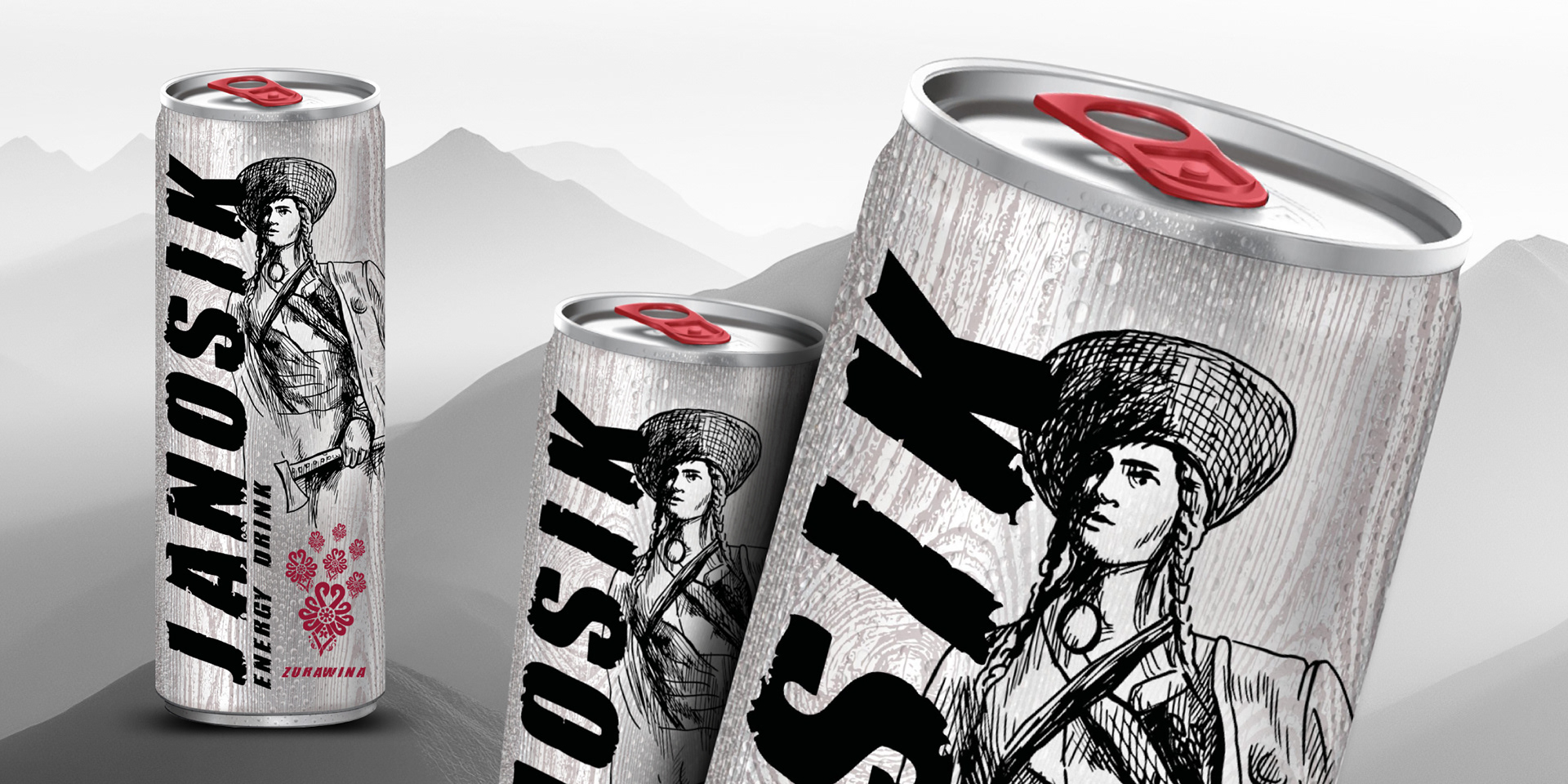
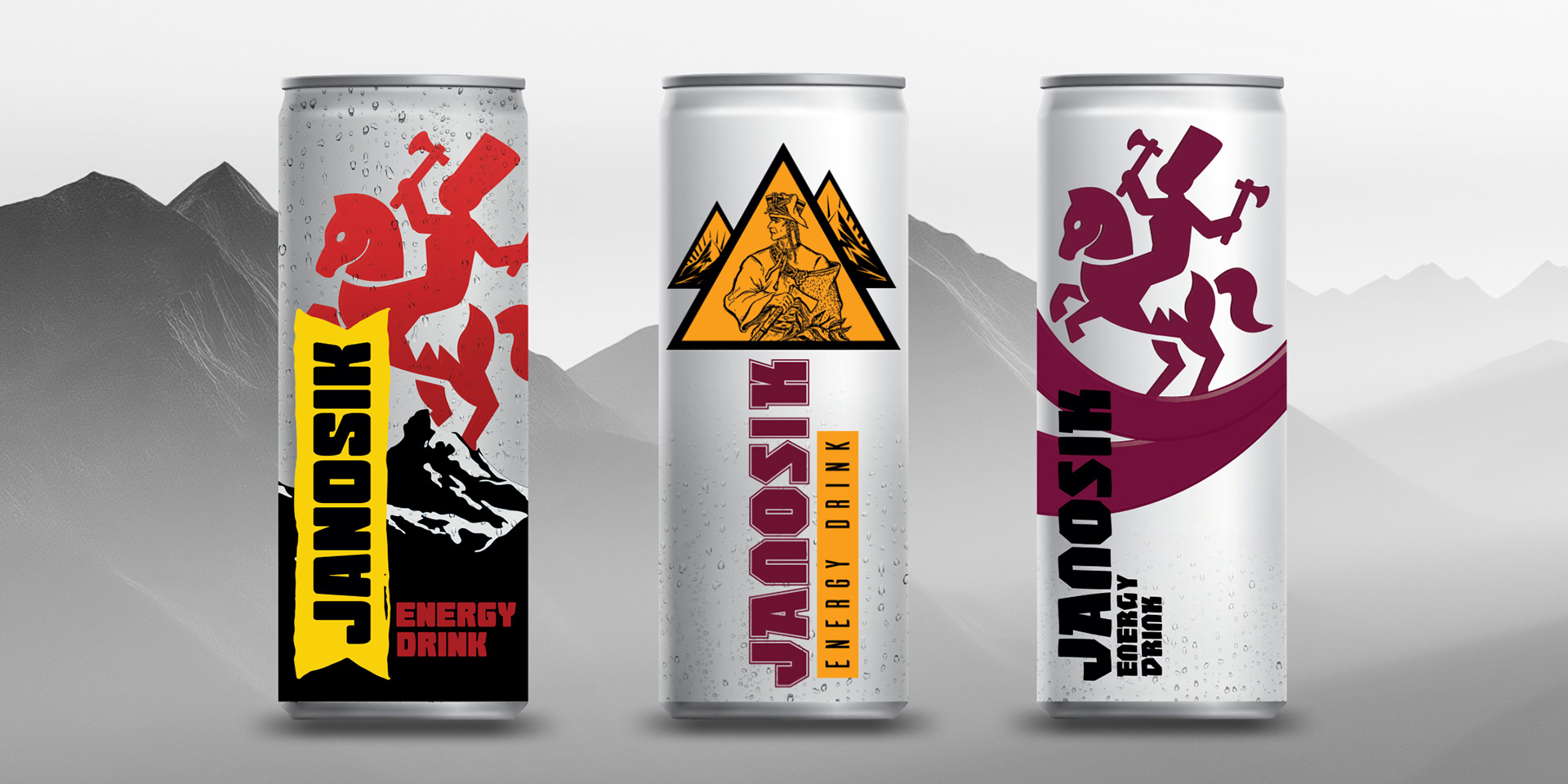
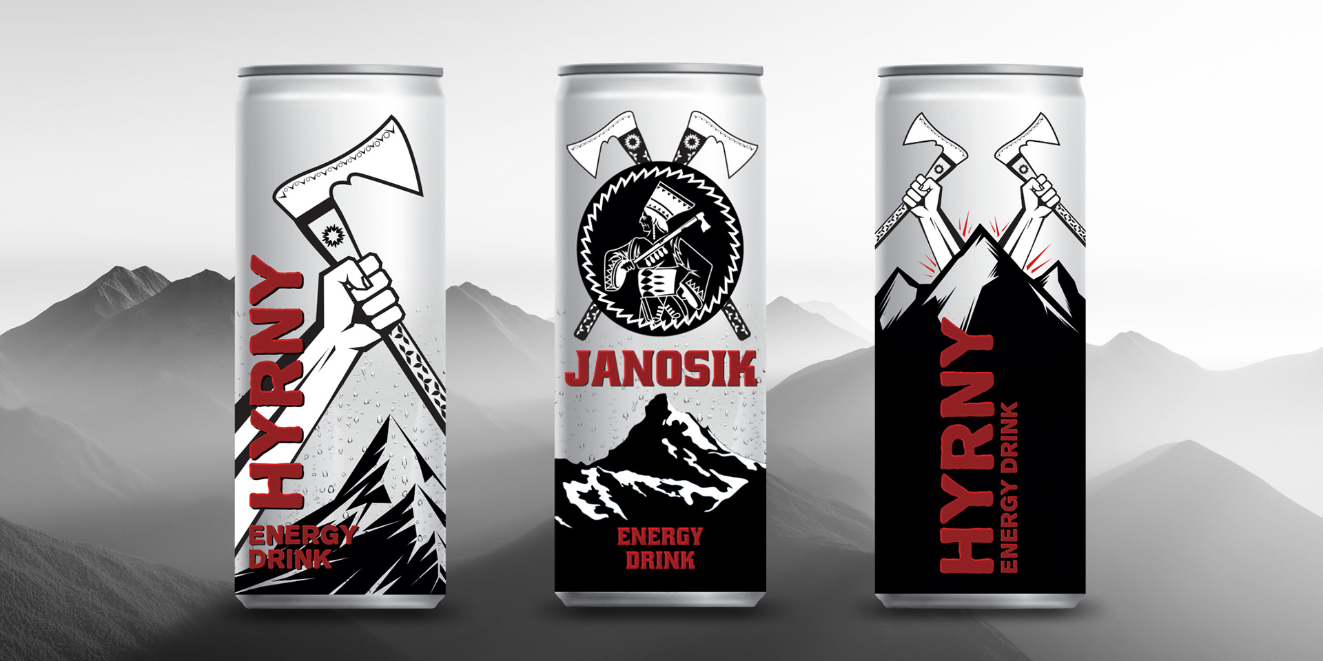
The prototype energy drink design draws inspiration from the majestic peaks and rugged strength of the southern Polish mountains, capturing their essence through bold, dynamic visuals. Central to the packaging is a stylized silhouette of the Tatra Mountains, intertwined with traditional regional symbols such as the highlander’s folk patterns and emblematic elements like the mountain Polish rosette and local decorative floral elements, which symbolize resilience and vitality. The can designs incorporate deep earthy tones combined with vibrant accents reflecting the alpine flora, creating a visual harmony that embodies both nature’s power and cultural heritage. Pack shots showcase the energy drink’s robust branding, with the emblematic motifs seamlessly blending modern typography and traditional artistry, emphasizing its roots in the region's proud history and natural strength. This design not only appeals visually but also pays homage to the region’s rich traditions, forging a strong identity that resonates with local pride and the energetic spirit of high mountain landscapes.